New Museum-Led Study Links Extreme Heat and Historical Housing Policy
Dr. Jeremy Hoffman, Museum scientist here. You’ve probably heard me talk about how cities can either amplify or dampen extreme heat due to their design, i.e. areas with concentrations of human landscapes like asphalt, brick and pavement can be much warmer than densely shaded parks and neighborhoods. This is referred to as the “urban heat island effect,” and it is a feature of nearly every human habitation on the planet. What you haven’t heard me talk about (yet) is new research that builds on previous urban heat island findings to link hotter surface temperatures with the New Deal-era neighborhood ranking system called “redlining.”
Urban Heat Island Campaign Recap
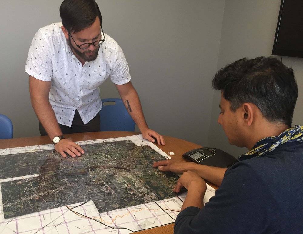
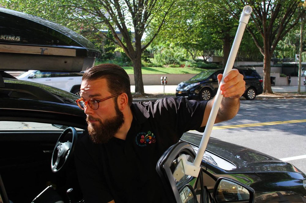
During a heat wave in July 2017, I led a research team made up of community organizations and volunteer scientists from VCU, UR, GroundworkRVA and the City of Richmond Office of Sustainability to collect more than 60,000 temperature readings across the Richmond area throughout the day. We discovered that there’s at least a 16-degree difference between the warmest and coolest parts of the city during an extreme heat event.
The Richmond project led us to ask if other cities see similar temperature differences during their heat events. So, in 2018 we conducted urban heat island campaigns in Baltimore, MD, and Washington, DC, and we worked with teams in Norfolk, VA, and Boston, MA, last year.
Guess what? The research shows similar double-digit differences in temperature in parts of each city at the same time during heat waves. As you might guess, no matter which city we explored, the coolest places had lots of dense shade and plants while the hottest places were low-slung industrial areas with very little tree cover.
New Questions
The interesting thing about science is the more questions get answered, the more it prompts new questions!
Credit: Jacob Fenston, WAMU
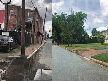
We were intrigued to see these consistent patterns in our urban heat island research, even though the underlying physical phenomenon has been well established since the 1980s. We also noticed something else in the data from Richmond: the hottest zones were in predominantly resource-limited communities. Checking the heat island maps generated for Portland, OR, and our work in Baltimore and Boston showed this same relationship: lower income and minority neighborhoods get much warmer than their neighbors do during heat waves.
In many previous studies, the story ends there: resource-limited communities are disproportionately exposed to extreme heat, with cascading effects related to their home energy use, air quality and health outcomes. But because of our involvement with community nonprofits in these cities conducting community science projects, we wanted to go deeper: is there a relationship between historical practices in urban planning and susceptibility to climate change in US cities?
Working with my urban heat island collaborator Vivek Shandas, Ph.D., Professor of Urban Studies and Planning at Portland State University, and Nicholas Pendleton, a then student in the Center for Environmental Studies at Virginia Commonwealth University, we compared the following datasets from 108 urban areas in 29 US states:
- Remotely-sensed land surface temperatures derived from United States Geological Survey and NASA satellite data
- The percentage of developed impervious surface land cover from the National Land Cover Database
- The percentage of tree canopy coverage from the United States Forest Service
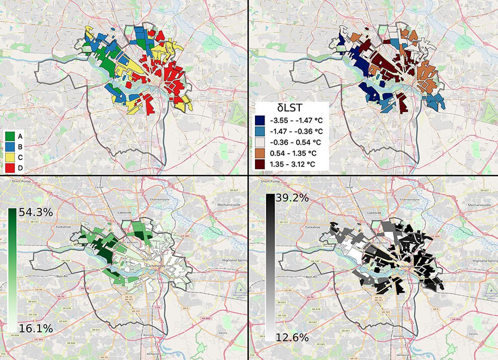
- Color-coded maps created by the Home Owners’ Loan Corporation which were digitized by the University of Richmond in 2018
What did we find? Glad you asked! Our research showed that formerly redlined neighborhoods – that is, neighborhoods that were systematically denied access to forms of wealth in the 1930s and 1940s – are now hotter than their non-redlined neighbors in 94 percent of the cities studied, with surface temperature differences within the same city topping 12 degrees Fahrenheit in some cases.
A History Lesson
Before we explain the findings in more detail, we need to examine what “redlining” means.
In the 1930s and 1940s, the Home Owners’ Loan Corporation, a government-sponsored corporation created as part of New Deal policy, divided 239 US cities with a population of more than 40,000 into color-coded blocks. The green, blue, yellow and red outlines ranked neighborhoods on perceived safety for lending and investment, from best (“A”) to hazardous (“D”) for lending. For the red-colored, or redlined, areas, the corporation recommended that lenders “refuse to make loans in these areas,” or do so only on a conservative basis.
Areas that were identified as red were referred to as having “undesirable populations” and had a consistent pattern of being lower wealth, lower land value, and communities of color and immigrants. Highlighting this with the color-coded maps, and making recommendations on what to do in those areas, deprived entire neighborhoods access to credit for generations. The resulting lack of investment likely set in motion the problems related to social poverty we observe today.
New Research
While the federally supported neighborhood ranking practice was banned in 1968, today those formerly redlined communities have fewer trees, less green space and more impervious surfaces (such as asphalt parking lots, roads and brick buildings), factors that likely contribute to hotter temperatures during heat waves, among other stressors like poorer air quality.
The research shows this, as redlined neighborhoods across the country are on average about 5 degrees warmer than non-redlined neighborhoods.
We are excited to release this research as we feel it opens doors to several more questions:
- What specifically caused the large variation in the consistent pattern we see across these cities?
- Why were Midwestern cities largely spared the largest of the intra-city differences?
- What policies or practices have either mitigated or reinforced these patterns over the last several decades?
Many of these questions can be answered using similar datasets to the ones we analyzed for this research. Others will require interdisciplinary approaches to integrate economic, health and urban planning data seamlessly alongside these maps of historical housing practices.
A Roadmap for the Future
While these findings may appear troubling (which they are, given that extreme heat waves are only becoming more intense, longer lasting, more frequent and happening earlier or later in the summer than before), there’s a benefit here. Better understanding the links between extreme heat and historical housing policy will help us -- the Museum, government entities, community groups, businesses and citizens -- collaboratively organize our efforts in the most efficient and effective way.
By focusing our attention and resources on rectifying these patterns of inequitable heat exposure in formerly redlined areas, we can expect some of the largest positive impacts associated with actions like greening vacant lots or developing coordinated plans to build climate resilience. Of course, all plans must include, if not be led by, community voices to avoid as much neighborhood resident displacement in the aftermath of investment as possible. Perhaps this is a chance to use the maps once used to exclude neighborhoods nearly 100 years ago to intentionally include them now in planning for the next 100 years.
From reviewing individual pieces of legislation proposed in the General Assembly [1,2,3] to attending community meetings about how neighborhood zoning categories can incorporate green space minimums, or from communicating with elected officials about climate related decisions to volunteering to plant trees with a community group like GroundworkRVA or BeautifulRVA, I am hopeful that this new research informs the decisions we all make today, decisions that have equity and inclusion top of mind.